
B2B Website Checklist for Mobile Devices


It’s 2015 and traffic from phones and tablets now trumps desktop Internet traffic. Consider this post your wakeup call to shore up your company website’s performance on mobile devices. Think this only applies to cutting edge consumer companies like those in the fashion and technology space?
Wrong. 86% of executives use their tablet and 72% use their smartphone to conduct research for products or services for their business (more stats). Ignoring the mobile experience can cost you serious business!
Making the upgrade isn’t as big of an initiative (or as expensive) as it was just a couple of years ago. This post is meant to be a high level guide to making better decisions about your web presence in a mobile world.
Step 1: Make Sure Your Website is Responsive
Developing a completely different mobile version of your website came and went about as fast as those little QR codes everyone had to have on their business cards (yuck). The new solution is called responsive web design, where your single website responds to the screen it is being displayed on. Check out how this website responds with different design and information based on the device you access it with:

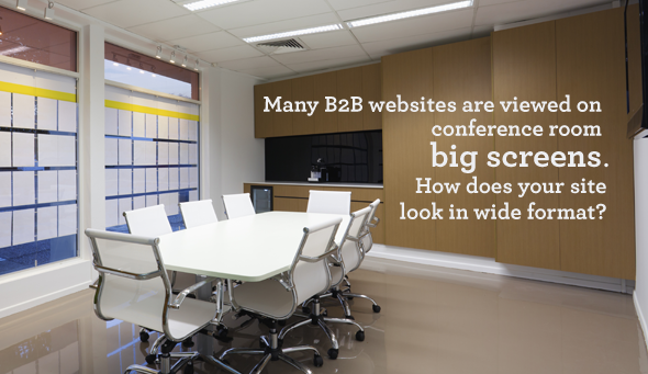
Today, there are infinite combinations of screen resolutions, hardware manufacturers and operating systems that your website will be viewed on (and new ones appearing on the market every day). Rather than trying to design the perfect website for every device, web developers have solved this problem by employing responsive stylesheets and fluid design that adapts to the screen resolution of the device and allows you to optimize the experience for phones, tablets, conference room big-screens and, of course, desktops.
If your website is key to your sales process then converting to a responsive design should be your top priority. Once you have that in place, the following opportunities are available to you.
Step 2: Understand How User Intent Might Change Per Device
We use websites in different ways on different devices. For example, a user on their phone may need directions and a phone number while rushing to a meeting, while a tablet user might be doing deep research on their couch. How you present your content and navigation should match how you believe most people will use your website on that particular device.
When we began a national radio campaign for our Guaranteed SEO program, we moved that link to the top of our home page on phones. The thinking was that someone would hear the ad in a car or while working out while listening to the business stations we targeted. There was an increased chance that a user accessing our home page on their phones was looking for the SEO service, so we made it stupid easy to find.
Understand that you do not need to make all of your content prominent on all devices. You can, but you do not have to. The goal is to design for the behavior you believe most users on exhibit on that device.
To illustrate this, here is how customers might interact differently with a B2B website on several device categories:
| Smartphone | Tablet | Laptop | Big Screen |
|---|---|---|---|
|
Find directions to your office. Look up your company after meeting one of your salespeople. Determine if you offer a product/service they need. |
Read long form content such as articles and blog posts. Watch training videos and product demos on your website. |
Copy and paste information into a report. Enter your website through deep pages via search engines. |
Present you as a potential vendor to a group of decision makers. Compare your website to a number of your competitors’ websites. |
One of the most important things to consider is which call-to-action will be most successful on each device. Perhaps your customer is more likely to download a whitepaper on a PC, but more likely to call or watch a video on their phone. As a general rule, I would reserve long lead forms for a PC and on calls and simple contact forms for a smartphone.
Prioritizing your content and call-to-actions for each device today can put you far ahead of your competition tomorrow.
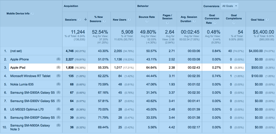
Step 3: Over Time, Optimize The Experience For Popular Devices
Now the fun really begins. Did you know that Google Analytics (and many other applications) can tell you which devices visit your website and how often? Without too much work, you can understand which devices are actually bringing you leads, and which are not. This lights the path for you to begin optimizing the experience based on your most popular devices. I look for high traffic devices that are not converting to see what I can change, and which devices are converting so that I can isolate that behavior.
There are also a number of touch screen and device best practices that you can work into your design over time. This checklist should help you avoid some of the most frustrating oversights that will turn your customers away on touch screens.
- Menus: Menus should be optimized for touch and smaller screen real estate. No one menu is the right menu, but there are some common menus that seem to work well on phones and tablets. Here are nine examples of mobile menus. Remember that not everyone will begin their visit on the home page. Will I know where to go if I click on a search engine or email link to a page deep in your website?
- Forms: Filling out a form is much more work on a touch device. And, users less often use auto-completion on mobile. As a general rule, use less fields, avoid double-confirmation of email address and give the form fields lots of white space so that fingers can easily access the right field. Here are some more tips for forms on devices.
- Buttons: The bigger the better. Seriously. Here is why.
- Fonts: Pay attention to size, color and line height. Don’t be afraid to use completely different styles between phones and PCs. The best advice here is to test and read your content on the smallest device you can find. How does it feel? Tedious or natural?
- Images: Some designs take the users ability double tap or spread zoom an image away. If you have graphics with text and data, this can render these graphics illegible. Can users zoom into images or are they naturally big enough?
- Retina displays: Did you know that many mobile devices like iPads, iPhones and many Samsung devices has screen resolution 3 – 4 times greater than standard monitors? New big screen displays are implementing similar technologies. For the first time since the web launched, designers need to consider multiple image resolutions. Make sure your images look as sharp as your text on these new displays. Here is more about designing for retina.
- Maps: It has become popular to embed Google Maps into contact pages on websites. This works wonderfully for PCs, but it can actually trap a user on a smart phone. You see, these maps have touch scrolling built in, so if an embedded map is larger than your screen size, the user will not longer have any page touch area left to scroll. On touch screens, stick to image maps that fit within your viewable area, then include a link to launch the phone’s map application.
- Sharing: Sharing content with others is natural and common on phones. Make sure you include clear buttons to help your prospects and fans share your content by email and on social.
Today, there is a new set of behaviors and realities that must be considered when designing your website. Mobile and touch devices will continue to proliferate our lives and influence our decision making processes, so adapt now or risk falling into obsolescence. And, remember, email is overwhelmingly read on mobile devices today, so anyone receiving links to your website via email is going to be disappointed when they access an unresponsive page.
Invest in a responsive experience for your website—it will pay off. We can help! Check out our website packages.

June 4 2015 in Blog, Content Strategy, Lead Generation
-

Learn how we can help your business

- SEO
- Social Media
- Website Design
- Content Creation

